Where-did-the-aces-go-
Where did the Aces go?
by Scott Silverstein

When I was a kid, Opening Day felt like a duel of No. 1s, and October meant handing the ball to the same horse in Games 1 and 7. Names like seen above Pedro Martínez, Roger Clemens, Randy Johnson, and Greg Maddux didn’t just pitch; they set the calendar. That’s the picture of an ace I grew up with.
Today the shape of pitching is different. Rotations run six or seven deep, starters throw fewer innings, and true separation at the top is rarer. The numbers hint at it: in the Juiced Ball years (2016–2019), roughly 6–7% of eligible starter-seasons graded as ace years; since 2021, it’s closer to ~3–4%. So is this a real ace drought—or did the game change what an ace looks like?
To find out, I’m treating “ace” like a measurable claim, not a vibe: a year-relative composite of ERA, WHIP, K/9, and WAR, with a simple workload floor, applied within each season’s context. The question isn’t just who feels like an ace, but how often ace-level seasons actually happen—and how many pitchers can repeat them. If the modern game truly flattens the top, the data should show it.
Step 1) How I Define (and Validate) an “Ace”
I didn’t want to define an ace by feel. I wanted a bar that says, with numbers, “this pitcher was truly better than his peers.” So I define an Ace Season as a year where a starter dominates his own season’s context across four core stats—ERA, WHIP, K/9, and WAR. I standardize each stat within the same year (so run environment and league-wide strikeout trends don’t skew things), flip ERA/WHIP so lower values become better, and average the four z-scores into one number: the Composite Ace Score (CAS). I also impose a workload floor of WAR ≥ 2.0 so tiny, fluky seasons don’t sneak in. With that setup, a season is an Ace Season if CAS ≥ 1.5. Intuitively, CAS = +1.5 means the pitcher is about 1.5 standard deviations better than his peers on the combined scale.
Here’s the quick proof that this definition works:
Out of 7,030 pitcher-seasons, about 4% (roughly 1 in 24) clear the ace bar. If you’re an ace this year, you have about a 44% chance of being an ace again in the next 1–2 seasons; if you’re not, it’s about 4%—a ~12× difference. The score also points forward: pitchers with a high CAS are ~3× more likely to land in the top 10% by WAR the next year (in other words, it’s good at telling who will be great). It isn’t just sneaking WAR back in either—using only ERA/WHIP/K/9 still lines up with value pretty well. And when I raise or lower the bar, the results move sensibly (~6.5%, 4.2%, 2.3% at easier/standard/stricter settings) without breaking the pattern. Bottom line: the line is strict, fair to each season, and actually predictive.
What does an ace pitcher look like?
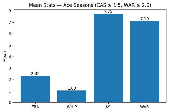
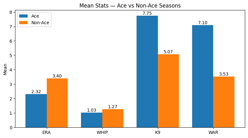
This is at least proof that the formula and the definition is working. The stats for aces is clearly a massive step above league average. So at least we know that we are looking at true aces, and we can use this definition of an ace to find out era specific numbers.
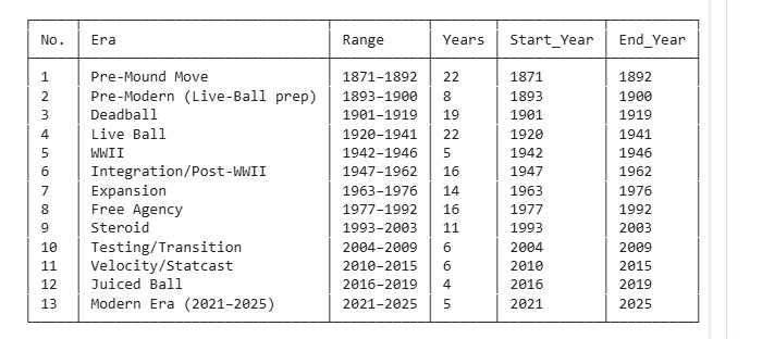
Step 2) Defining Eras
This admittedly was done not as scientifically as one would have liked. Many have tried to classify eras, when they start when they end, what they are known for, etc. and few have been successful. This article isn’t about defining eras anyhow, so I am just using a standardized breakdown of eras that is widely accepted.
Step 3) Handling eras of different lengths
To keep long eras from overwhelming short ones, I measure aces as a per-year percentage. For each season, I compute the share of eligible starter-seasons that qualify as Ace Seasons; then I average those percentages within an era. In other words, each year gets one vote, so a 5-year era and a 20-year era are comparable. I also show a secondary check—aces per 100 starter-seasons—and, where helpful, 95% confidence intervals so short eras (like 2021–2025) are clearly marked as noisier. Together, this lets me compare eras fairly while acknowledging their different sizes.
Step 4) Run the formula to find the aces.
Start with the big picture.
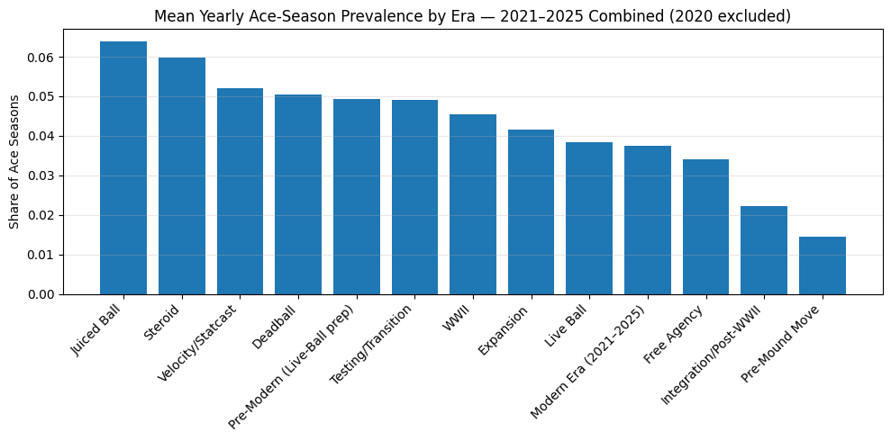
In a typical year of each era, what share of eligible starter-seasons cleared the ace bar (CAS ≥ 1.5, WAR ≥ 2.0)?
Juiced Ball (2016–2019) and Steroid (1993–2003) sit on top at roughly 6–6.5%; a middle pack hovers near 5% (Velocity/Statcast, Deadball, Pre-Modern, Testing/Transition, WWII); and the Modern Era (2021–2025) lands lower, around 3.7%, above Free Agency but below most recent eras.
But how certain are those differences?
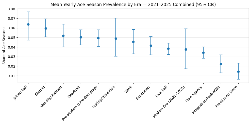
What you’re looking at: each dot is an era’s average share of ace seasons per year (CAS ≥ 1.5 among eligible starters; 2020 excluded). The vertical whiskers are 95% confidence intervals built by resampling the years in that era. Think of them as the plausible range for the true era average—if we could replay that era’s seasons many times, about 19 out of 20 such intervals would cover the real value.
How to read it: longer eras (more seasons) have tighter intervals; short eras (e.g., WWII, Modern 2021–2025) have wide intervals, so their point estimates are noisy. Non-overlapping intervals suggest clearer separation; heavy overlap means the ranking is uncertain.
What it says:
- The Juiced Ball and Steroid eras sit at the top (~6–6.5% ace seasons) and are clearly above the early-era lows (Integration/Post-WWII, Pre-Mound Move).
- A middle band—Velocity/Statcast, Deadball, Pre-Modern, Testing/Transition, WWII, Expansion—clusters around 4–5%.
- The Modern Era (2021–2025) average is lower (~3.7%) but its wide interval overlaps much of the middle pack, which means we should treat any precise ranking for modern years as provisional until more seasons accrue.
Bottom line: even accounting for uncertainty, the chart supports a simple story: the mid-’90s through late-2010s were a high-water mark for ace seasons, while the modern period appears leaner at the very top—though the exact gap will sharpen as more post-2021 data comes in.
So are there fewer ace seasons or fewer ace pitchers?
Short answer: both.
The modern period has fewer ace seasons and fewer ace pitchers than the peak eras.
-
Season lens (how often it happens): In the Juiced Ball years, about 6–7% of eligible starter-seasons qualified as ace seasons; since 2021, it’s about ~3–4% per year. Even with wide uncertainty for recent seasons, the modern rate sits below the 1990s–2010s high-water mark.
-
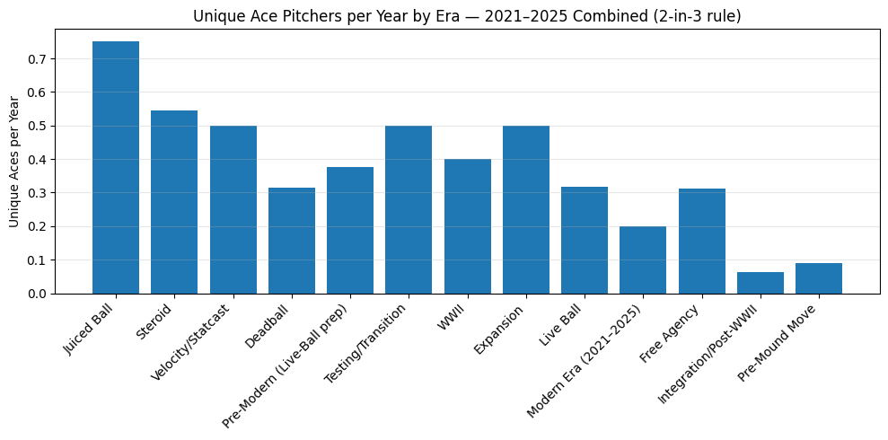
Pitcher lens (who can repeat it): The number of confirmed ace pitchers per year (≥2 ace seasons in any 3-year window) is also down—roughly ~0.20 in the modern era versus ~0.75 in Juiced Ball and ~0.55 in the Steroid era. Many current arms show one ace season but haven’t had time to post a second (right-censoring), yet the gap remains even accounting for that.
Caveat: The modern estimate is provisional (fewer years, wider error bars), and a couple more seasons could move it. But taken together—frequency of ace seasons and count of repeat ace pitchers—the data points to a thinner very top today than in the mid-’90s through late-2010s.
Step 5) Increase amount of aces to account for small seasons.
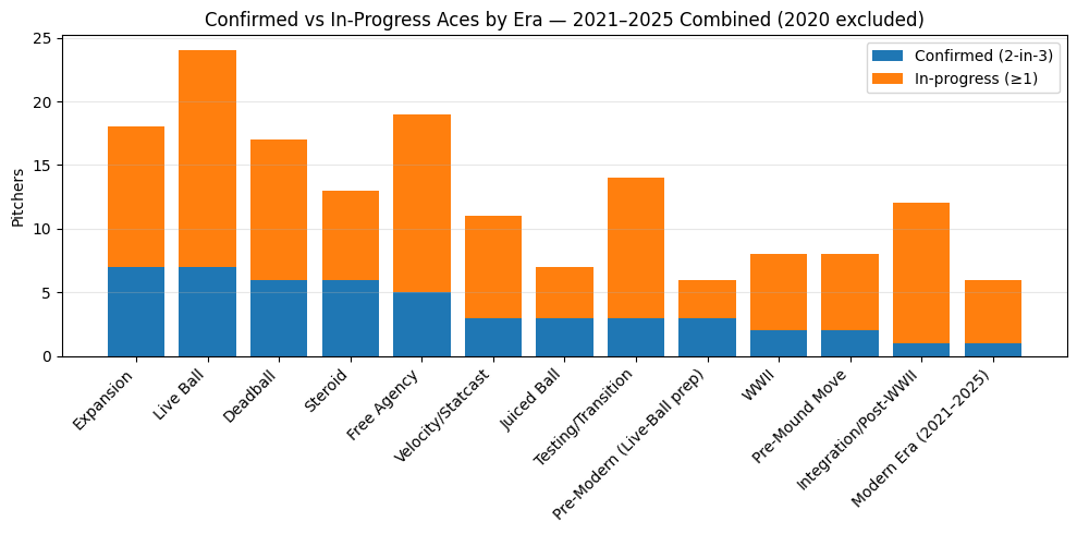
Why show “in-progress” aces at all?
The 2-in-3 rule (≥ 2 Ace Seasons within any 3-year window) is a good test of repeatable dominance, and as we have seen it punishes short, recent eras—there simply aren’t enough seasons yet for active pitchers to record a second ace year. That’s classic right-censoring.
To counter that, I split the people view into two buckets:
- Confirmed aces — already meet the 2-in-3 bar within the era.
- In-progress aces — have ≥ 1 Ace Season in the era, but haven’t had enough time (or seasons) to earn the second one yet.
This lets recent eras show their pipeline of potential aces rather than looking artificially empty. It should increase the number of “aces” by essentially lowering the bar to be considered an ace.
Results:
If the modern game were overflowing with ace-caliber arms who just need time, you’d expect a small blue bar (few confirmed) but a very large orange bar (many in-progress). Instead, the Modern Era (2021–2025) shows both a small confirmed count and only a modest in-progress count. Even after giving modern pitchers credit for one ace season and lowering the bar on what is considered an ace, the era remains thin compared to peak periods.
Taken together, the in-progress split addresses the “not enough seasons yet” caveat and reinforces the main finding: today’s game has fewer ace seasons and fewer ace pitchers, not merely a timing artifact. It also explains why true standouts feel rarer—depth has risen, but separation at the very top has shrunk.
How many eligible pitchers are aces? (people-level rate)
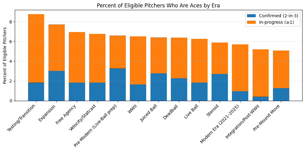
To normalize for era length and expansion, I convert the counts above into percentages of unique eligible pitchers within each era (stacked into Confirmed and In-progress). This reframes the question as, “Out of the pitchers who met the workload floor in an era, what share were ace-caliber?”
- This lens reduces the bias toward long eras and highlights how concentrated the ace label is within a cohort of pitchers.
- Recent eras still show a big in-progress slice, reflecting ongoing careers; older eras skew more confirmed.
How this connects to the season-level results
People-level charts answer “how many ace pitchers did an era have?” Both the raw counts and the percent of eligible pitchers point to the same story: the Modern Era (so far) has fewer confirmed aces and still third to last within the in-progress pool, while mid-1990s through late-2010s eras are richer in both confirmed and inprogress.
To compare eras purely on how often ace seasons happen, I also use the per-year prevalence and 95% confidence intervals (season-level view). That approach treats each year as one vote, which is the fairest way to compare eras of very different lengths. Together, the people-level and season-level views paint a consistent picture: recent history (’90s–2010s) looks like a high-water mark for aces, and the current period is thinner at the very top, with the important caveat that some modern arms are still building their résumés.
Almost without a doubt: There are less ace pitchers
So confirmed, there are indeed fewer aces nowadays. Pitchers are so unbelievably good that if you stand out in today’s game you are really something special. If you are classified as an ace in todays game through these metrics Hall of Fame is almost definite. Yay for the Tarik Skubal’s and future Paul Skenes’.
If you want to see the code go to https://github.com/silvesco94/Where-did-the-aces-go-/blob/main/aces.ipynb