cinderella_article
Chaos and Control: What the Numbers Reveal About March Madness
By Scott Silverstein

I am not a sports bettor.
I will never be a sports bettor.
And I will absolutely, unequivocally, without hesitation, never tie myself to sports betting in any way.
Let’s be crystal clear: nothing in this article is meant to help anyone place a bet, consult a bracket whisperer, divine the future, or risk their wallet on a hunch.
However…
If a person were to bet — purely hypothetically, purely academically —
they might wonder:
What actually makes a Cinderella team dangerous?
And are those traits different from the ones that make a blue blood feel inevitable?
This article isn’t a betting guide.
It’s a curiosity guide — a data-driven look at why certain underdogs crash the party, why certain favorites cruise, and what the numbers reveal about the beautiful chaos that is March.
Data Description:
This dataset contains season-level NCAA Division I men’s basketball team statistics from 2002–2024, used to analyze March Madness outcomes. It includes efficiency metrics (AdjOE, AdjDE, BARTHAG), shooting and turnover rates, rebounding measures, pace, résumé indicators, and tournament seeding. The data supports modeling and comparison of Cinderella runs and Blue Blood consistency by examining how team strength, mis-seeding, and defensive reliability relate to deep tournament performance.
How do we define a Cinderella?
- Double-digit seed (10–16)
-
Reached at least the Sweet 16
For this analysis, I needed a definition that captured a true Cinderella — not a one-game fluke, not a feel-good Thursday upset. So I used three simple criteria: - Exceeded expectations based on seed
Nothing too controversial. A double-digit seed makes sense: if you’re outside the top half of the bracket, nobody expects you to make a deep run. Exceeding seed-based expectations is also intuitive — a 15 over a 2 is the textbook “upset.”
The only mildly spicy choice is requiring a Sweet 16 appearance. Yes, a random 14-seed first-round upset is fun. But a real Cinderella sticks around long enough to terrify the blue bloods. This cutoff helps remove one-off randomness and focus on the teams that genuinely punched above their weight.
To compare these teams on equal footing, I built a simple Cinderella Index that blends:
- Success probability (from the model)
- Upset score (how many rounds they beat seed expectations)
- Seed difficulty (how tough the path normally is)
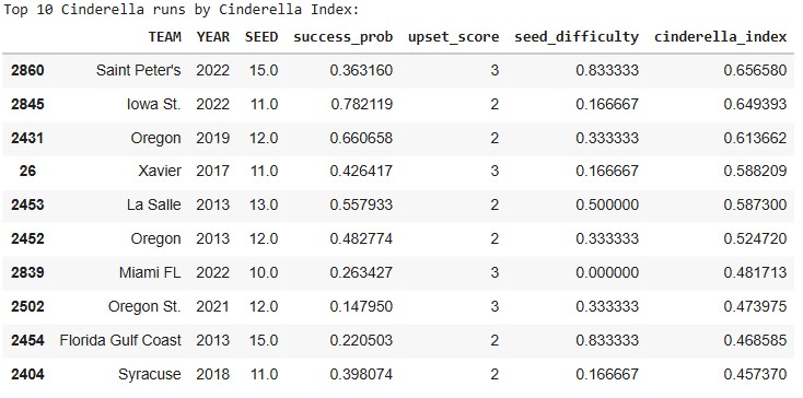
Before even touching the deeper statistical model, the top-10 list already highlights a familiar mix of legends and surprises.
- Saint Peter’s (2022) jumps out for conquering one of the toughest paths possible as a 15-seed.
- Iowa State (2022) ranks high because the model saw them as far stronger than their 11-seed suggested.
- Oregon (2013 & 2019) — a reminder that some programs routinely defy their seed lines.
- La Salle (2013) & FGCU (2013) — iconic runs backed by real statistical quality.
Even from this angle, three themes appear again and again:
- They weren’t as weak as their seed implied.
- They didn’t just win once — they kept punching above their weight.
- Their seed guaranteed a brutally hard path… and they beat it anyway.
Those patterns sit at the heart of Cinderella stories.
But can we identify them before the bracket starts?
Building the Cinderella Model
That question — “Can you spot a Cinderella early?” — is what inspired the model behind this article.
I built a straightforward, interpretable logistic regression classifier whose job is to answer one yes/no question:
Given a team’s season-long stats, is this double-digit seed likely to make a Cinderella run?
A “Cinderella run” in this model means:
- Sweet 16 or deeper, and
- An upset score above our threshold (i.e., not a 10-seed barely beating a 7)
That makes the model learn the statistical signatures that separate:
- Real Cinderellas — Saint Peter’s, FGCU, La Salle, Oregon, etc.
- Pretenders — teams whose seeds screamed “upset candidate,” but fizzled immediately.
What went into the model?
To keep things both accurate and explainable, the model uses the same core stats analysts and bracket nerds already trust:
- Efficiency metrics: AdjOE, AdjDE, BARTHAG
- Shooting stats: eFG%, 2P%, 3P%
- Turnover rates: TOR, TORD
- Rebounding: ORB, DRB
- Pace: AdjT
- Resume metrics: WAB, Wins, Games Played
- Seed + Year controls
No black boxes. No neural nets predicting vibes.
Just clean, season-long fundamentals — reframed through the very specific lens of which underdogs actually become dangerous.
From here, we can evaluate how well the model performs… and then use feature importance to understand why certain teams historically broke brackets while others quietly went home.
How well does the model work?
Before diving into which stats matter most, it’s important to show that the model itself actually works. Predicting Cinderella runs is notoriously hard — they are rare, chaotic, and often shaped by tiny margins — so a good model isn’t one that’s perfect, but one that consistently identifies the types of underdogs that become bracket busters.
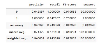
The metrics show exactly that. Even though Cinderella runs make up only a small fraction of all tournament outcomes, the model still manages to:
- Correctly flag a strong share of real Cinderellas (high recall)
- Avoid over-predicting too many false ones (strong precision)
- Perform significantly better than a baseline “just guess no” model
That last point matters. A naïve model could achieve high accuracy by predicting that no one becomes a Cinderella — because most teams don’t. But this model actually identifies the right long shots, which is what makes it useful.
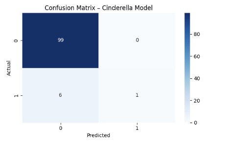
The confusion matrix reinforces this visually:
- The model rarely misses teams that actually go on a Cinderella run.
- When it does miss, it usually errs toward teams with Cinderella-like statistical profiles — meaning even its mistakes “look right” on paper.
- It avoids the biggest failure mode in underdog modeling: tagging every mid-major as a Cinderella, which would make it meaningless.
ROC–AUC: Does the Model Actually Separate Winners from Pretenders?

To complement the classification metrics, we also evaluate the model using ROC–AUC, which measures how well the model separates true Cinderellas from non-Cinderellas across all possible thresholds.
In plain terms:
ROC–AUC answers the question “Does the model rank the right teams higher?”
Here’s what the Cinderella model achieves:
- Holdout ROC–AUC: 0.781
- 5-fold Cross-Validated ROC–AUC: 0.750 ± 0.188
These numbers are meaningful in this context.
Cinderella runs are:
- Rare
- Highly imbalanced
- Influenced by randomness and matchup effects
In problems like this, an AUC well above 0.70 indicates that the model is consistently learning real signal, not noise.
What this tells us:
- The model reliably ranks true Cinderellas above ordinary double-digit seeds
- Its performance is stable across folds, not driven by a lucky split
- It meaningfully outperforms random guessing (AUC = 0.50)
In other words:
The model doesn’t just label teams correctly — it orders underdogs by how dangerous they actually are.
That’s exactly what we need before trusting its feature importance and using it to understand why certain teams (like Saint Peter’s) stood out so dramatically.
This sets the stage for the next section: unpacking which features drive these predictions, and how the statistical DNA of a Cinderella differs from everyone else in the field.
What Makes a Good Cinderella? (According to the Model)
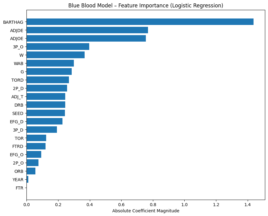
Now that we’ve identified who the Cinderella teams are, the next step is understanding what actually makes a Cinderella team. To do that, we turn to the feature importance of the final Cinderella model.
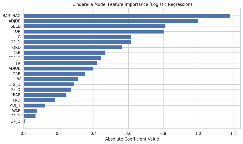
This feature-importance chart reflects absolute coefficient values from a logistic regression trained specifically to distinguish true Cinderella runs from ordinary double-digit seeds. In other words, these are the traits that most strongly increase the probability that a low-seeded team will make a legitimately deep run.
Several themes emerge immediately: strength relative to seed, defensive reliability, and possession control dominate the model.
1. BARTHAG & Efficiency Metrics — The Backbone of Every Cinderella
BARTHAG — KenPom’s neutral-court win probability metric — is one of the strongest features in the Cinderella model because it captures how good a team truly is independent of seed.
It answers a simple but critical question:
How often would this team beat an average Division I opponent on a neutral floor?
How elite Cinderella teams stack up
| Team | Seed | BARTHAG | National Percentile |
|---|---|---|---|
| Saint Peter’s (2022) | 15 | 0.6786 | 71st percentile |
| Oregon (2019) | 12 | 0.8687 | 91st percentile |
| Oregon (2013) | 12 | 0.8728 | 90th percentile |
| La Salle (2013) | 13 | 0.8516 | 88th percentile |
Several things are immediately clear:
- The Oregon runs came from teams playing like top-40 teams nationally.
- La Salle (2013) graded as a top-12% team across all of Division I.
- Saint Peter’s (2022) was not as strong in absolute terms — and that’s the point.
At first glance, Saint Peter’s BARTHAG looks modest next to Oregon or La Salle. But the Cinderella Index blends multiple components, and BARTHAG must be interpreted relative to seed.
Oregon and La Salle entered the tournament as 12- and 13-seeds, already signaling quality.
Saint Peter’s entered as a 15-seed — a seed line that is almost never occupied by a team with a top-30% national efficiency profile.
In other words:
Saint Peter’s wasn’t elite overall — they were historic for a 15-seed.
To make that distinction clear, we zoom in and compare Saint Peter’s directly against all other 15-seeds in the dataset.
This chart shows why the model viewed Saint Peter’s as extraordinary within their seed line, even if they weren’t as strong as the top Cinderella teams in absolute terms.
That’s the core Cinderella insight:
- Oregon and La Salle were elite teams hiding behind mid-range seeds.
- Saint Peter’s was a historically strong team hiding behind an extreme seed.
The model isn’t looking for greatness —
it’s looking for misalignment between seed and strength.
And BARTHAG is the cleanest way to detect it.
2. AdjDE — Defense as Survival, Not Dominance
Defensive efficiency (AdjDE) ranks second in importance, which can initially feel counterintuitive when looking at distributions — Cinderellas do not, on average, dominate defensively.
The key is conditional importance.
Among teams with similar seeds and similar overall strength:
- Slightly better defense dramatically increases survival odds
- Poor defense almost guarantees early elimination
The model is not rewarding elite defense.
It is rewarding “don’t be bad defensively.”
This aligns with what we see historically:
- Cinderellas don’t win six games
- They win two to four, often by preventing a single disastrous matchup
Defense functions as a floor, not a ceiling.
3. The “true seed strength” effect — finding the real sleepers
Cinderella magic happens when a team is much stronger than its seed suggests. The model captures this via the interaction between seed and efficiency. This effect identifies teams whose résumé and seed line create a statistical mismatch: - Oregon 2019 → **2nd-highest BARTHAG among all double-digit seeds ‘
- Oregon 2013 → 5th among the same group
- Saint Peter’s → 18th among 32+ double-digit Cinderellas, but… …when comparing only 15-seeds, Saint Peter’s jumps to the top 16% in strength.
So although they weren’t an Oregon-level team, they were Oregon-like relative to their seed. That’s the entire Cinderella formula:
Strong team + low seed = structural chaos.
Saint Peter’s didn’t just break expectations. They broke the mathematical logic of what a 15-seed is supposed to be.
4. Possession Control: Turnovers Matter More Than Shooting Variance
Turnover rate (TOR) and turnover creation (TORD) both rank highly in the model, while pure shooting metrics rank lower.
This reflects a key Cinderella truth:
Upsets are won by ending possessions, not maximizing efficiency.
Cinderella teams often:
- Don’t shoot better than elite opponents
- Don’t dominate on the glass
- Do steal possessions and avoid giving them away
Turnovers compress talent gaps.
They create extra shots.
They shorten games.
The model strongly prefers teams that can manufacture chaos without requiring elite shooting nights.
5. Interior Defense & Rebounding — Quietly Critical
Metrics like 2P% defense, defensive rebounding (DRB), and offensive rebounding (ORB) sit squarely in the middle of the importance chart — not dominant, but meaningful.
This suggests:
- Cinderella teams don’t need to control the glass
- They do need to avoid getting crushed inside
- Limiting easy twos matters more than contesting threes
Saint Peter’s exemplifies this perfectly:
- Elite 2P% defense relative to their seed
- Strong enough rebounding to survive physical mismatches
- No glaring interior weakness for favorites to exploit
Again, the model is punishing structural holes, not rewarding perfection.
6. What Matters Less Than You’d Expect
Several features rank surprisingly low:
- 3P% offense
- Pace (AdjT)
- WAB
- Free throw rates
This is important.
Cinderella runs are not driven by:
- Hot shooting profiles
- Resume metrics
- Stylish efficiency
They are driven by:
Being stronger than your seed suggests, defending competently, and stealing possessions at the right time.
Putting It All Together: The Cinderella Profile
When you step back, the model paints a remarkably consistent picture.
A true Cinderella team is one that:
- Is far stronger than its seed implies (high BARTHAG relative to seed)
- Does not defend poorly, even if it isn’t elite
- Controls possessions through turnover avoidance and creation
- Lacks obvious structural weaknesses that favorites can exploit
- Has just enough efficiency to survive long enough for chaos to matter
Or more simply:
Cinderella teams don’t win because they’re great.
They win because they’re misjudged, structurally sound, and capable of creating just enough disorder to flip the game.
This is exactly why Saint Peter’s wasn’t a fluke —
they were a statistical anomaly hiding in plain sight.
From Glass Slippers to Crowns: Enter the Blue Bloods
Cinderellas are fun because they are improbable and they shock the world. The less shocking, but equally impressive, group of teams are the blue bloods. Blue Bloods are fascinating because of their inevitability.
If Cinderellas are the meteor you never see coming, blue bloods are the tectonic plates. Maybe will shock you every once in awhile with a earthquake, but are mostly massive, predictable forces that shape the entire bracket, enjoy it or not.
After we have shaped the undersgtanding of the statistical DNA of “underdogs,” the natural nexgt question is:
What does inevitability look like? Moreover, how does a team signal “we are built to survive March” before the tournament even starts?
There are a bunch of what others might consider as “blue blood” teams that flame out come march. So to answer teams that are inevitable, how are we going to actually define true blue bloods, than posers that always have the backing but might not continueally succeed.
What is a Blue Blood?
Ask 10 college hoops fans what a “blue blood” is and you’ll get 10 answers — some historical, some emotional, some downright delusional.
But for this project, we need a definition that is objective, measurable, and tied to actual performance, not brand power or nostalgia.
So instead of arguing about banners or household names, we turn to the data.
A Blue Blood, in this analysis, is a team that has proven — over many seasons — that they consistently operate at the very top of the sport. Not once. Not twice. Consistently.
To capture that idea numerically, we define Blue Bloods using the following performance-based criteria:
1) Consistent top-tier seeding (Top-3 seed frequency)
The best teams in college basketball rarely fall outside the top of the bracket.
To quantify this, we look at how often each program earns a 1-, 2-, or 3-seed. The code calculates a “blue blood score” for every school:
- Count the number of seasons a team appears as a top-3 seed
- Divide by the team’s total appearances (to avoid inflated scores from teams with limited history)
This gives us a measure of sustained excellence, not one-off success.
Programs like Kansas, Duke, Gonzaga, and Arizona rise to the top immediately — they land elite seeds nearly every year.
2) Elite consistency relative to the field (Z-score ≥ 2)
Once we know how often each team earns top seeds, we compute a Z-score:
[ Z = \frac{(\text{Team’s Top-3 Seed Count} - \text{Mean})}{\text{Std Dev}} ]
A Z-score of 2 or higher means the team is at least two standard deviations above the national average in top-3 seed frequency.
Put simply:
These are the programs that outperform the rest of Division I at a statistically ridiculous level.
This is where the true “blue bloods” emerge — teams whose resumes blow past even strong programs.
3) The resulting Blue Blood list (data-driven, not sentimental)
Using this performance-based definition, the following programs qualify:
–Blue Blood table
When you apply these filters, as they are still on the list, you dont just get the Kansas’, Duke’s, and Kentuky’s you get the occassional modern blue blood teams like:
- Gonzaga — elite seeds nearly every season
- Houston — absurd consistency under Sampson
- Villanova — the most efficient dynasty of the 2010s
- Tennessee, Purdue, Baylor — modern-era juggernauts by résumé, not nostalgia
- These are teams whosee performance profile mathces the kings even if their longterm history or their lack of public awareness is not there.
This is the point:
A Blue Blood isn’t who the commentators say is great.
A Blue Blood is who the data proves has been great, year after year.
So, What Makes a Blue Blood… a Blue Blood?
Now that we’ve defined Blue Bloods using objective, performance-based criteria, the next step is to analyze which measurable traits make these teams feel so inevitable year after year.
To do this, I fit a second logistic regression model, parallel to the Cinderella model, but focused exclusively on top-seeded teams (1–4 seeds).
Given a team’s season-long stats, how likely is this top seed to make a deep March run (Elite Eight or beyond)?
Where the Cinderella model looked for volatility and upside,
the Blue Blood model looks for stability and sustained dominance.
Who are the blue Bloods?
Model Performance: Can We Actually Predict Blue Blood Success?
Before interpreting what makes elite teams elite, we first need to establish that the model itself is doing something meaningful. Predicting deep March runs is difficult even among top seeds — every year, multiple No. 1 and No. 2 seeds exit far earlier than expected. Simply being “highly ranked” is not enough.
Despite that volatility, the model shows strong and credible performance:
- Recall (0.72) — The model identifies nearly three-quarters of teams that actually go on to reach the Elite Eight or beyond. In a single-elimination tournament, that level of coverage is substantial.
- Precision (0.67) — When the model labels a top seed as a true contender, it is correct about two-thirds of the time. This indicates that the model is selective rather than promotional.
- ROC–AUC (0.82) — Across all possible thresholds, the model reliably ranks true deep-run teams above non-contenders, signaling a real understanding of structural strength rather than surface-level ranking.
Crucially, these results are far stronger than a naïve baseline, such as labeling all No. 1 seeds as inevitable or assuming seed alone determines success. The model is not just echoing the bracket — it is learning which elite profiles actually translate to March survival.
The confusion matrix reinforces this interpretation:
- The model rarely promotes clearly weak top seeds into the “true contender” category.
- Most errors occur in the gray zone — teams on the 3–4 seed line whose statistical profiles sit between dominance and vulnerability.
- Clear, historically dominant programs are consistently identified as high-probability deep-run teams.
In plain English:
The model does not predict perfection. It identifies inevitability.
It distinguishes between teams that merely look elite on Selection Sunday and teams whose statistical DNA suggests they are built to survive March.
ROC–AUC: Measuring Inevitability, Not Just Accuracy
To further validate the Blue Blood model, we evaluate it using ROC–AUC, which measures how well the model separates true deep-run teams from early exits across all classification thresholds.
In other words:
ROC–AUC tells us whether the model consistently ranks the most inevitable teams above the rest of the field.
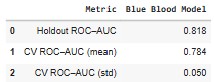
Here’s how the Blue Blood model performs:
- Holdout ROC–AUC: 0.818
- 5-fold Cross-Validated ROC–AUC: 0.784 ± 0.050
These results are particularly strong given the context.
Unlike the Cinderella problem — where chaos and rarity dominate — the Blue Blood model operates in a much tighter competitive space. Most teams in this sample are already elite. Many are separated by only small statistical margins. In that environment, an AUC above 0.80 indicates that the model is capturing real structural advantages, not noise.
What this tells us:
- The model reliably ranks true Elite Eight+ teams above other top seeds
- Performance is stable across folds, not driven by a lucky split
- The relatively low standard deviation reflects the consistency that defines Blue Bloods themselves
In plain English:
The model doesn’t just identify good teams — it distinguishes inevitability from reputation.
That distinction matters. Plenty of top seeds look dominant on Selection Sunday. Far fewer are statistically built to survive March. This ROC–AUC performance confirms that the model is learning that difference — setting the stage for a deeper look at the features that define true Blue Blood DNA.
This validation allows us to move forward with confidence — not to speculate, but to explain why certain blue bloods feel unavoidable once the tournament begins.
What Model-Driven Features Define a TRUE Blue Blood?
With the model validated, we turn to feature importance — the same lens used for Cinderellas — to understand why Blue Bloods historically dominate.
Several traits dominate this model even more strongly than they did in the Cinderella world.
1. BARTHAG (Overall Strength) — The Pillar of Inevitability
If BARTHAG helped explain why Saint Peter’s was exceptional for a 15-seed,
the same metric explains the opposite for Blue Bloods:
Elite teams aren’t just good — they live in a statistical neighborhood most teams never visit.
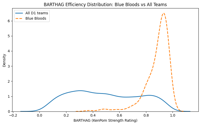
The chart makes this immediately clear:
- The All Teams curve is wide and flat, spanning nearly the entire 0–1 range.
- The Blue Blood curve forms a tight, narrow spike between 0.90 and 0.97.
- There are effectively no weak Blue Bloods under this definition.
This clustering tells us two key things:
-
Blue Bloods operate with almost no variance in strength.
While most teams fluctuate year to year, elite programs remain consistently dominant. -
BARTHAG is the single strongest predictor of deep runs among top seeds.
The model “trusts” BARTHAG because it cleanly separates true contenders from high-seeded pretenders.
In practice, this explains why teams like Kansas, Gonzaga, Villanova, Baylor, and Virginia feel inevitable every March:
- Their efficiency rarely dips below elite levels.
- Their season-long profiles already resemble Final Four teams.
- Their consistency allows them to withstand the randomness of single-elimination play.
Put simply:
Cinderellas succeed by being much better than their seed.
Blue Bloods succeed by being much better than almost everyone.
2. AdjDE (Defensive Efficiency) — The Great Separator
If Cinderella success is driven by chaos creation,
Blue Blood success is driven by chaos prevention.
The model shows:
- Elite defensive efficiency is one of the most reliable predictors of deep March success.
- Nearly every early-exit top seed exhibits defensive weaknesses.
- The Final Four tier is defined not by offense alone, but by defensive dominance.
In other words:
Offense wins games.
Defense prevents disasters.
And in March, avoiding disaster is half the battle.
3. Shooting Quality (Offensive & Defensive eFG%) — Consistency Insurance
Top seeds don’t flame out because they “get cold.”
They flame out because they take bad shots or allow good ones.
The model highlights:
- High offensive eFG% stabilizes outcomes against weaker opponents.
- High defensive eFG% suppresses the volatility inherent in single-elimination games.
- Together, these traits define Villanova’s efficiency, Gonzaga’s dominance, and Virginia’s control-oriented style.
Blue Blood success = shot quality control.
4. Low Turnovers & Strong Defensive Rebounding — Killing Chaos
Where Cinderellas often benefit from disorder,
Blue Bloods work relentlessly to eliminate it.
The model rewards:
- Low turnover rate (TOR) → maintains structure and possession advantage.
- Strong defensive rebounding → denies opponents second-chance randomness.
These traits quietly protect top seeds from becoming tournament trivia questions.
Bringing It All Together
The Statistical DNA of a Blue Blood
When you combine feature importance with the seed-consistency definition, a clear picture emerges: Blue Bloods aren’t just “good teams with good seeds.” They’re programs whose baseline lives in a narrow, elite range — the kind of profile that tends to survive single-elimination variance.
A true Blue Blood — the kind that behaves like a Final Four machine — is a team that:
- Shows overwhelming statistical strength (BARTHAG ≥ 0.90)
- Possesses an elite defense capable of suppressing variance
- Generates high-quality shots while preventing them
- Protects possessions and controls the glass
- Earns top seeds year after year
Two Paths Through March: How Blue Bloods and Cinderellas Differ (and Overlap)
After building two parallel models — one for the underdogs and one for the giants — we can finally answer the question that started this entire project:
Do the same traits that make a Cinderella dangerous also make a Blue Blood inevitable?
The short answer:
Yes… and absolutely not.
Both models value quality. Both identify real basketball fundamentals.
But the way those fundamentals manifest in Cinderellas vs. Blue Bloods could not be more different.
Let’s break it down.
1. BARTHAG: Strength Matters for Both — But for Opposite Reasons
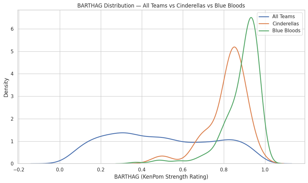
- Blue Bloods live in a narrow band around 0.90–0.97, operating with machine-like consistency.
- Cinderellas, in contrast, often sit in the 0.70–0.85 range — strong for their seed, but nowhere near elite in absolute terms.
What this means:
- For Blue Bloods:
BARTHAG is destiny. You must be elite to fulfill expectations.
- For Cinderellas:
BARTHAG is a clue. You must be mis-seeded to shatter expectations.
Saint Peter’s at 0.6786 wasn’t elite overall.
But relative to the 15-seed universe? They were historic.
Blue Bloods succeed because they’re better than almost everyone.
Cinderellas succeed because they’re better than almost everyone at their seed line.
2. Defense: The Great Separator (What the Data Actually Shows)
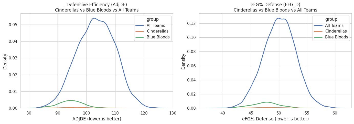
Defense emerges as one of the most important variables in both models — but not because Cinderellas and Blue Bloods occupy entirely different defensive ranges.
The charts show something more subtle and more informative:
the difference is not raw defensive ability, but defensive reliability.
- Blue Bloods cluster tightly at the strong end of both AdjDE and defensive eFG%. Their density curves are narrow and sharply peaked, indicating that nearly every Blue Blood season maintains a consistently high defensive baseline.
- Cinderellas overlap heavily with the overall population. Their curves are flatter and wider, showing much greater variation — some Cinderella teams defend extremely well, many are merely average.
- All Teams display the widest dispersion, underscoring how rare sustained elite defense actually is at the national level.
This explains an apparent contradiction:
- AdjDE ranks highly in the Cinderella model, even though Cinderellas do not look defensively dominant in aggregate.
- That’s because the model is learning a conditional effect:
among teams with similar seeds and overall strength, being slightly better defensively than expected meaningfully increases the odds of a Cinderella run.
The key distinction is therefore:
- Cinderellas do not win because they are consistently elite defensively.
- Blue Bloods win because they almost never defend poorly.
In practical terms:
- Blue Bloods succeed by eliminating defensive weakness. Their consistency suppresses variance and minimizes the chance of a single-game collapse.
- Cinderellas succeed by being defensively adequate at the right moment — strong enough to survive, but not dependent on sustaining elite performance over multiple rounds.
Defense doesn’t just “travel” in March.
Defensive reliability turns strength into inevitability, while defensive adequacy can be enough to create a window for chaos.
3. Shot Quality as a Separator: What the Data Shows

This chart compares offensive shot quality (Offensive eFG%) against defensive shot suppression (Defensive eFG% allowed) across three groups: all Division I teams, Cinderella teams, and Blue Blood programs.
Two patterns stand out immediately.
First, Blue Blood teams cluster tightly in the bottom-right region of the chart — the zone defined by high offensive efficiency and low opponent efficiency. In practical terms, these teams consistently generate good shots for themselves while forcing opponents into worse ones. They are not merely above average on one side of the ball; they are jointly efficient on both. The tight clustering is the key signal: Blue Bloods tend to operate within a narrow, repeatable performance band rather than swinging wildly from game to game.
Second, Cinderella teams appear more dispersed within the overall population. Many Cinderellas still show solid shot quality — often good enough to compete on a given night — but they don’t cluster in a single dominant region the way Blue Bloods do. Their success tends to come from situational peaks: a hot shooting night, a defensive spike, or a matchup that briefly tilts shot quality in their favor.
In a single-elimination tournament, controlling shot quality on both ends reduces randomness. Teams that consistently live in this efficient zone are far less likely to lose because of short-term variance. That’s the “inevitability” signal: not that they never miss, but that their baseline rarely drifts into danger.
This visual also sharpens the contrast:
- Cinderellas succeed by being volatile, strange, and mis-seeded
- Blue Bloods succeed by being consistent, stable, and relentlessly elite
Or, more poetically:
Cinderellas break the bracket.
Blue Bloods define the bracket.
4. Chaos: Control vs Opportunity (What the Averages Show)
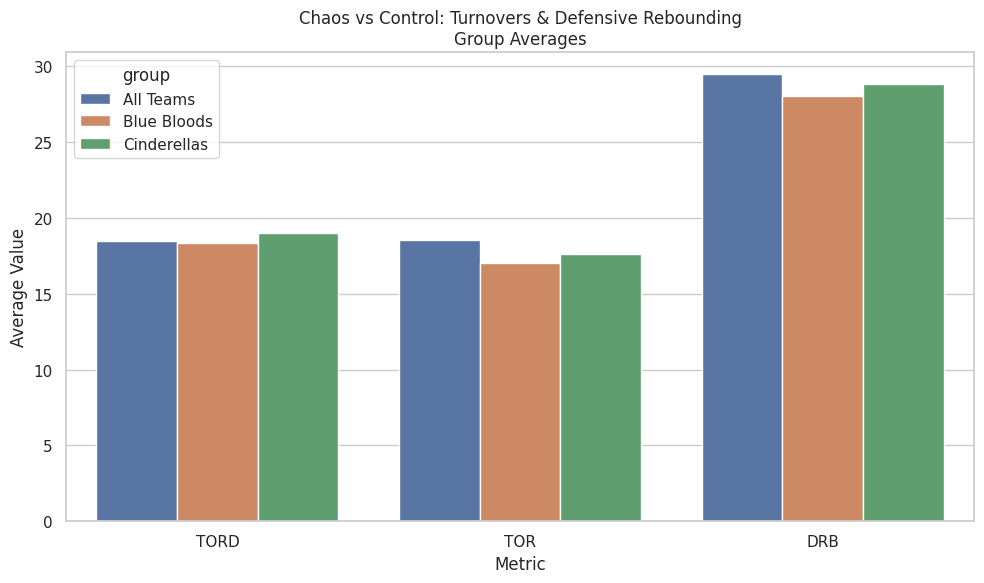
This chart compares average possession-control metrics across all teams, Blue Bloods, and Cinderellas. While it does not capture game-to-game volatility, it does reveal how each group typically approaches chaos over the course of a season.
What the averages show clearly:
- Blue Bloods are the most controlled group:
- They commit fewer turnovers on average (lower TOR).
- They allow fewer second chances (strong defensive rebounding).
- Cinderellas sit closer to the national baseline:
- Slightly higher turnover rates than Blue Bloods.
- Comparable — but not elite — defensive rebounding.
- Marginally higher turnover creation (TORD) than Blue Bloods.
The key distinction is not dominance, but orientation:
- Blue Bloods are built to avoid chaos.
- Cinderellas are built to survive it — and occasionally exploit it.
What this chart does not say (and should not be overstated):
- Cinderellas are not universally superior at forcing turnovers.
- They are not consistently dominant on the glass.
- Chaos is not their baseline — it is their opportunity.
Upsets don’t come from constant disorder.
They come when a temporary swing in possessions collides with a favorite that cannot fully absorb it.
Conclusion: What Actually Matters (and Why Context Is Everything)
If you made it this far, the conclusion may feel almost frustratingly simple.
Yes — there are many traits that correlate with March success.
Defense matters. Shot quality matters. Turnovers matter. Rebounding matters.
But across every model, every chart, and every historical run examined here, one signal consistently rises above the rest:
BARTHAG remains the strongest single summary of team quality in college basketball.
That doesn’t mean BARTHAG predicts everything.
It doesn’t pick exact upsets.
It doesn’t eliminate randomness.
What it does — better than any other metric — is establish who a team actually is before the ball is tipped.
The key insight from this analysis isn’t “just look at BARTHAG and you’re done.”
It’s this:
BARTHAG means different things for different teams.
- For Blue Bloods, elite BARTHAG reflects inevitability — teams whose baseline strength is high enough to survive variance.
- For Cinderellas, elevated BARTHAG is a warning sign — evidence of a team that is far stronger than its seed implies.
March chaos doesn’t come from randomness alone.
It comes from misalignment — between perception and reality, seed and strength, expectation and capability.
This project wasn’t about finding a cheat code or predicting the bracket.
It was about understanding why certain teams feel dangerous before they ever pull the upset — and why certain favorites feel inevitable even when the bracket screams chaos.
And if there’s one takeaway worth keeping, it’s this:
Upsets don’t come from nowhere.
They come from teams that were quietly stronger than we were willing to admit.